Background
Earlier this year, an internal team at a major retail bank asked me to review their mobile app loan journeys.
Marketing performance was strong - users were clicking ads, landing on the app, and starting applications - but many dropped off mid-process.
The hypothesis: the issue wasn’t awareness, but user experience.
I was brought in to find where users were getting stuck, confused, or losing trust within the app.
My focus was Home Loan (Mortgage) and their Personal Loan.
My Process
I applied for both loans myself - multiple times - noting every step and friction point.
Each flow was mapped in Figma, broken into 3–5 screen stages, and scored (0–10) on clarity, consistency, feedback, and predictability as based in Nilsen Norman's Usability Heuristics.
These weren’t design-quality ratings but usability indicators showing where friction occurs.
I also benchmarked the experience against OTP (DSK), UniCredit Bulbank, Monzo, and Monese to gauge how the flows compare to modern banking UX.
Findings
Home Loan (Mortgage)
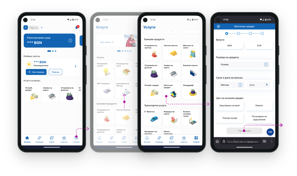
Recently added to the app, but still opens as a web form, not a native experience. It feels like leaving the app - a small break that erodes trust. That small break immediately hurts trust and continuity.
The process works, but it feels detached and slightly confusing in places:
- It’s hard to find (nested under Services → Banking products).
- The visual hierarchy and spacing feel inconsistent.
- Validation messages are vague, forcing users to guess what went wrong.
Overall: technically functional, but lacking polish and confidence.
Usability score: ~6.5/10
Personal Loan
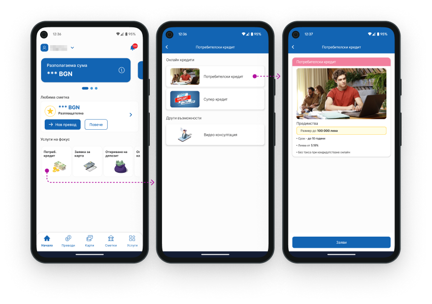
The Personal Loan journey, in contrast, is native, fast, and well-structured.
It demonstrates strong UX fundamentals but still has friction in communication and clarity:
- Two visually identical loan options with no explanation.
- A progress bar that doesn’t reflect real progress.
- Notifications that don’t link directly to next steps.
Overall: a solid experience that could feel far smoother with better feedback loops and clearer context.
Usability score: ~7.6/10
Competitor Benchmark
Bank Experience Ratings
- OTP (DSK) - Mostly web-based → Score: 6.6
- UniCredit Bulbank - Clean, clear, confident → Score: 9.3
- Monzo - Friendly tone, great feedback → Score: 9.5
- Monese - Simple but text-light → Score: 9.0
Recommendations
For Home Loans
1. Easier Access to the Mortgage Loan Option
Currently, the mortgage loan option is hidden deep within the “Bank Products” menu, while the consumer loan is accessible directly from the home screen.
Moving it to a more visible place - for example, the main menu or home screen - will save users time and effort.
2. Full In-App Integration
Redirecting users to a web form in the browser can create insecurity and reduce trust, as users expect the process to take place within the app itself.
A fully integrated interface, without leaving the app, will ensure a calmer and more reliable experience.
3. Unified Design and Visual Consistency
Differences in styling elements such as field sizes, typography, and visual indicators cause confusion and a lack of consistency.
A standardized design using consistent visual elements and clear information hierarchy will make understanding and navigation easier.
4. Clear Progress and Status Indicator
Currently, the progress indicator does not update based on the number of screens completed, which creates uncertainty about the remaining steps.
A better-structured indicator will give users a clear sense of where they are in the process and whether they can save progress and return later.
5. Improved Validation and Error Feedback
When incorrect data is entered, the system doesn’t provide specific error information but simply sends the user back to the previous screen. This can lead to re-entering data at random, causing frustration and drop-off risk.
Adding clear error messages and highlighting problematic fields will make the process more intuitive.
6. Additional Explanatory Texts
The lack of brief instructions for some options makes it harder for users, who must look for information on their own. For example, the choice of “Service Office” is not explained, leading to unnecessary confusion.
Adding short explanatory texts under key fields will help users make informed decisions without wasting time searching elsewhere.
For Personal Loans
1. Clearer Differentiation of Credit Options
Currently, “Consumer Loan” and “Super Loan” look almost identical, and their terms become visible only after selection.
This can cause confusion and unnecessary extra clicks.
Adding short descriptions under each option or visual differences in their appearance would help users choose faster without wondering what each one means.
2. Dynamic Progress Indicator
The progress indicator does not update on every step, which makes it unclear how many steps remain.
This can create the feeling that the process is longer or less predictable.
Adjusting the indicator so it updates on each step would help users plan their time and understand how close they are to completion.
3. Intuitive Navigation After Approval
After approval, users receive a notification that a document is waiting for signature under “Pending Signature,” but there’s no direct link to it.
This forces them to manually search through menus, leading to inconvenience and time loss.
Adding a direct button in the notification would make the process faster, smoother, and more intuitive by removing unnecessary searching.
4. Improved Visual Styling and Hierarchy
Although the credit terms page is informative, it lacks clear visual hierarchy and is harder to scan.
Users must read everything carefully instead of spotting key information immediately.
Improving typography, contrast, and spacing between elements would make the content easier to read and visually more balanced.
5. Explanatory Text for Important Steps
Options such as “Choose an Office” and “Comparison” don’t have enough context, which makes them unclear to users.
This can lead to confusion about whether a choice is mandatory or just optional.
Adding short clarifying notes under these options would make them more understandable and reduce uncertainty during use.
6. Clearer Validation of Entered Data
When there’s an input error, the system doesn’t show where the issue is, which may lead to re-entering data at random.
This creates frustration and can cause users to abandon the process.
Adding clear error messages that specify what exactly needs correction would make the process easier and more efficient.
Final Thoughts
The audit confirmed the team’s intuition: marketing isn’t the problem - the UX is.
The journeys are technically sound but fall short on communication, predictability, and trust.
Fixing these doesn’t require a redesign - only a focused UX polish.
Once that’s done, marketing spend will start converting more effectively, because the product will finally deliver on the promise.